How to see your data in a diagram (Pandas and Matplotlib)
Python: My last blog request from the month of September 2025 are now in a script with Pandas and Matplotlib.
What is the advantage of this kind of visualization?
You are not only independent of the operating system, but also of licence costs and specific software versions, as Python, Pandas and Matplotlib are free and open source software.
Excel is only working in Windows and Mac. Linux cannot use Excel as an installed program. Yes, in the cloud, but then it costs money. Microsoft is not an aid organization. Linux, Windows and Mac users can use LibreOffice. But, what if LibreOffice does not exists?
Yes, it is uncomfortable to type in all values. Up to now there is no automatic, perhaps in the future when the AI will program itself.
What is Pandas?
Pandas is a fast, powerful, flexible and easy to use open source data analysis and manipulation tool,
built on top of the Python programming language.
How I get this pandas?
You have to install this module.
If you have already installed Python, then you have to install Pandas with the following command in your command line (terminal):
pip3 install pandas
How to use this module
In every Python script, it begins with
import pandas as pd
What is matplotlib?
Matplotlib is a comprehensive library for creating static, animated, and interactive visualizations in Python. Matplotlib makes easy things easy and hard things possible.
From the official website of Matplotlib
How I get this Matplotlib?
You have to install this module.
If you have already installed Python, then you have to install Matplotlib with the following command in your command line (terminal):
pip3 install matplotlib
How to use this module
In every Python script, it begins with
import matplotlib.pyplot as plt
The script
import pandas as pd
import matplotlib.pyplot as plt

data_mit_fehler = {"Days": ["01.09", "02.09","03.09","04.09","05.09", "06.09","07.09","08.09","09.09.","10.09","11.09","12.09","13.09","14.09","15.09","16.09","17.09","18.09","19.09","20.09","21.09","22.09","23.09","24.09","25.09","26.09","27.09","28.09","29.09","30.09"],
"request":
[1152, 961, 2720, 1364, 1228, 1795, 1232, 2171, 2458, 1055, 2467, 3372, 4116, 2780, 4295, 6745, 7676, 5692, 1785, 5425, 5492, 3796, 4917, 3416, 2531, 1112, 7011, 3433, 2628, 1753]}

plt.figure(figsize=(20,6))
plt.bar(data_mit_fehler["Days"],data_mit_fehler["request"],color="skyblue")
plt.xlabel("Days")
plt.ylabel("request")
plt.title("Bar chart")
plt.show()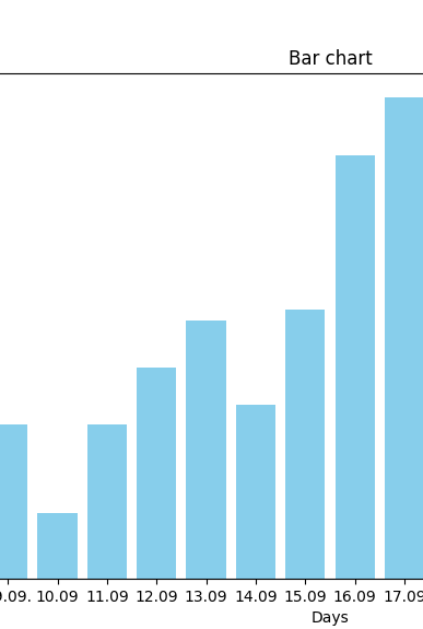
You can save this bar chart for your pc.
The most important icon is the diskette (right side last icon), where you can save this chart into a .png file.
How does the script work?
The first variable is a dictionary. This case is a dictionary. The „normal“ dictionary looks like:
variable = {„word 1″:“value 1“, „word 2″:“value 2“} – yes it looks like a JSON-file what you could know from the database MongoDB.
plt.figure(figsize=(20,6)) = defines the window size (the output – matplotlib produce a new window, value 20 stands for the bright, 6 for the height)
plt.bar(data_mit_fehler[„Days“],data_mit_fehler[„request“], color=“skyblue“) = defines first what kind of chart do you want to have. This case is a bar chart that show the x and y labels and there are the data is saved and the color of chart.
plt.xlabel(„Days“)
plt.ylabel(„request“) = define the label in the coordinate system.
plt.title(„Bar chart“) = defines the title of the cart.
plt.show() = Displays the created graphic in a separate window and blocks further execution of the script until the window is closed.